Thermal Camera Colors Meaning: How to Read the Palette
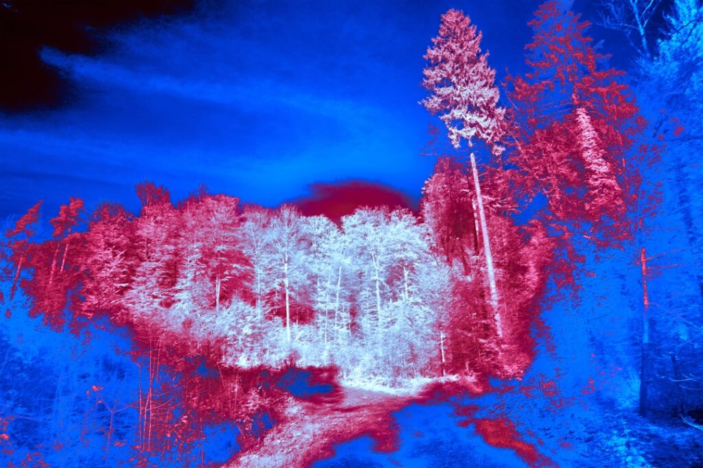
The first time someone looks at a thermal image, the colors seem to promise an obvious answer: red is hot, blue is cold, problem solved. The reality is more nuanced and more useful once understood. Thermal camera colors are an assigned map of temperature, not a fixed code, and the same scene can look completely different depending on the palette and settings chosen. Understanding thermal camera colors and their meaning is what separates reading an image from guessing at it.
What Thermal Camera Colors Actually Mean
A thermal camera measures the infrared energy radiating from surfaces and assigns a color to each temperature in the scene. The colors are not inherent to the objects; they are a visualization the camera applies, called a color palette or look-up table. The camera takes the range of temperatures it sees and stretches a chosen set of colors across that range.
This means the color is relative, not absolute. A spot shown as bright yellow is the warmest in that particular image with that particular range setting; change the scene or the settings and the same temperature might appear a different color. The palette tells you how surfaces compare to one another in temperature, and the on-screen temperature scale, the colored bar with numbers, tells you what actual values those colors represent. Reading both together is the foundation of interpretation, a skill that complements the broader workflow in our home inspection tools guide.
For inspection work, the goal is usually to spot anomalies, areas that differ from their surroundings, rather than to read a precise temperature off a color. The colors highlight the difference; the scale and a separate measurement quantify it.
The Common Thermal Palettes
Cameras offer several palettes, each suited to different tasks. Knowing what each emphasizes helps you choose the right one and read it correctly.
Iron (Ironbow)
The iron palette is the most widely used in building inspection. It maps cold to dark purples and blacks, mid temperatures to reds and oranges, and the hottest areas to bright yellow and white. It mimics the way heated metal glows, hence the name. Iron offers a good balance of detail and intuitive hot-to-cold reading, which is why it is a default for moisture and insulation work.
Rainbow (and Rainbow High Contrast)
The rainbow palette spreads the full color spectrum across the temperature range, typically blue and purple for cold up through green, yellow, and red for hot. It exaggerates small temperature differences, making subtle anomalies pop, but it can be busy and harder to interpret because the many color transitions can imply more variation than exists. It is useful when hunting faint patterns.
Grayscale (White-Hot and Black-Hot)
Grayscale palettes use shades of gray. White-hot shows hot as white and cold as black; black-hot inverts it. Grayscale preserves fine detail and edges well, which is why it is common in security and some scientific uses, and some inspectors prefer it for spotting sharp-edged thermal features. The trade-off is that it is less immediately intuitive for hot-versus-cold at a glance.
Hot vs Cold: Why You Cannot Assume
The single most common mistake is assuming a color always means the same temperature. It does not. On the iron palette, white is hottest; on a black-hot grayscale, black is hottest; on white-hot, white is hottest. Without checking which palette is active and reading the temperature scale, a viewer can invert hot and cold entirely.
Context compounds this. A cool blue patch on a ceiling might be evaporative cooling from moisture in summer, a genuine concern, or simply the cooler area near an air vent. A warm spot might be a real electrical fault or just sunlight that recently hit the wall. The colors flag where to look; they do not explain why. The interpretation depends on knowing the palette, reading the scale, and applying judgment about the building, which is exactly the discipline emphasized in our guide to using a thermal camera on a house.
Span and Level: The Settings That Reshape the Image
Two adjustments change a thermal image more than the palette choice does: level and span. Understanding them is the difference between an image that reveals a problem and one that hides it.
Span, sometimes called range or contrast, is the width of the temperature window the palette is stretched across. A wide span spreads the colors over a large temperature range, so small differences barely register. A narrow span concentrates all the colors across a small temperature window, dramatically exaggerating tiny differences, which is how a faint, half-degree moisture pattern becomes a vivid, obvious shape.
Level, sometimes called center, sets the midpoint of that window, where in the temperature scale the colors are centered. Adjusting level slides the color window up or down the temperature range so it sits over the temperatures of interest. Skilled thermographers narrow the span and set the level to bracket the suspected anomaly, tuning the image until the pattern stands out clearly. An auto-ranging camera does this automatically, which is convenient but can either flatten a subtle anomaly or exaggerate noise, so manual control matters for serious diagnosis.
Why the Same Wall Can Look Fine or Alarming
Because span and level reshape the image, the identical surface can appear uniform or dramatically patchy depending on the settings. This is not the camera lying; it is the operator choosing how to display the data. It also means a screenshot without its temperature scale and settings is nearly impossible to interpret reliably, which is why credible thermal reports always include the scale and often the measured temperatures.
Reading a Thermal Image the Right Way
Putting it together, reading a thermal image means four habits. Check which palette is active, so you know which color is hot. Read the temperature scale beside the image to convert colors to actual values. Consider the span and level, recognizing that a vivid pattern on a narrow span may represent a small real difference. And treat every color anomaly as a clue to investigate, not a conclusion.
For building work, the colors are a search aid. A thermal camera shows where surfaces differ in temperature; confirming what causes the difference, moisture, missing insulation, an electrical fault, requires a second tool and an understanding of the building. The colors are a powerful way to see the invisible, but only when read with the palette, scale, and settings in mind rather than at face value.
Why a Color Is Not a Temperature
The deepest misconception worth dispelling is that a particular color corresponds to a particular temperature. It does not. The camera assigns colors across whatever temperature range is present in the scene, so the same shade of orange can represent 70 degrees in one image and 110 degrees in another, depending on the range and settings. Colors encode relative position within the displayed range, not fixed temperatures.
This is why the temperature scale beside the image is indispensable. The scale anchors the colors to actual values, telling you that the warmest color in this particular frame corresponds to a specific temperature and the coolest to another. Without that scale, a colorful image is just a relative map with no quantitative meaning. Professional thermographers never interpret an image without its scale, and credible reports always include it. A screenshot stripped of its scale and settings, common on social media and in marketing, cannot be reliably interpreted, which is worth remembering when evaluating dramatic-looking thermal images presented without context.
Color Interpretation in Real Building Scenarios
Applying this to actual inspection situations clarifies how the colors guide diagnosis. Suppose an inspector scans a ceiling and sees a cool, irregularly shaped blue patch on an iron palette. The color signals that area is cooler than its surroundings, which could mean evaporative cooling from moisture, a missing patch of insulation letting cold attic air through, or simply proximity to an air vent. The color identifies the anomaly; it does not name the cause.
Or consider an electrical panel where one breaker glows bright white-yellow against cooler neighbors. The color flags an abnormally warm component, possibly a loose connection or overloaded circuit, prompting a closer look and an electrician’s follow-up. In both cases, the color does the same job: it makes a temperature difference visible so the inspector knows where to investigate. The next step is always to interpret the anomaly in context and confirm the cause with another method, a moisture meter for the ceiling, a qualified electrician for the panel. The palette tells you where; the diagnosis comes from the inspector’s judgment and the confirming tool.
How Palette Choice Affects What You Catch
The palette you select changes which anomalies stand out, so experienced users switch palettes deliberately for different tasks. The iron palette’s smooth gradient from dark cold tones to bright hot ones suits general building work, giving an intuitive read while preserving moderate detail. When hunting a very faint pattern, a thin moisture trail or a subtle insulation void, the rainbow palette’s many color transitions exaggerate small differences and make them pop, at the cost of a busier, sometimes overstated image.
Grayscale palettes preserve the finest edge detail and avoid the visual clutter of color, which is why some inspectors switch to white-hot or black-hot to examine the precise shape and boundary of an anomaly once the iron palette has located it. None of these palettes changes the underlying temperature data; they change how it is displayed, and therefore which features the eye notices. A capable operator treats the palette as one more adjustable variable, alongside span and level, to be tuned to the question at hand rather than left on a single default for every situation.
Auto-Range vs. Manual Control of the Color Scale
Most modern thermal cameras default to an automatic ranging mode, which continuously adjusts the temperature window and the color scale to fit whatever is in the frame. This is convenient and keeps the image looking balanced as the camera moves, but it has consequences for interpretation. Because the scale shifts automatically, the same color can represent different temperatures from one moment to the next, and a subtle anomaly may be flattened into the surrounding colors or, conversely, random temperature noise may be exaggerated into a dramatic-looking pattern.
Manual control of level and span is what serious diagnosis relies on. By locking the span to a narrow window and setting the level to center on the temperatures of interest, an operator can make a faint, half-degree anomaly stand out clearly and consistently. This is also why two images of the same wall can look entirely different: one taken in auto mode and one with a tuned manual range. Neither is wrong, but the manual image is usually the more diagnostic one. For homeowners reviewing thermal images, this is a reason to value the accompanying temperature scale and the operator’s explanation over the raw drama of the colors, which can be amplified or muted by the ranging mode alone.
Reading a Thermal Report as a Homeowner
When thermal images appear in an inspection or energy-audit report, a few habits help a homeowner read them correctly rather than reacting to the colors at face value. First, find the temperature scale beside each image and note which color corresponds to hot and which to cold for that palette; do not assume red is hot or blue is cold without checking. Second, look at the actual temperature values, not just the color intensity, since a vivid pattern on a narrow span may represent only a small real difference.
Third, treat each colored anomaly as a flagged area for further evaluation rather than a confirmed defect, because the colors show where surfaces differ in temperature, not why. A cool patch might be moisture, an insulation gap, or simply an air vent, and the report should say which, supported by a moisture meter or other confirmation. A credible thermal report includes the scale, explains each significant anomaly in context, and ties conclusions to a confirming method. Approaching the images with the palette, scale, and settings in mind turns a set of striking colors into the useful diagnostic clues they are meant to be, neither dismissed nor over-interpreted.
References
- Infrared Thermal Imaging Inspection — International Association of Certified Home Inspectors
- Thermographic Inspections of Buildings — U.S. Department of Energy
- Standard of Practice — American Society of Home Inspectors
Thermal imaging cameras
Infrared cameras reveal hidden moisture, missing insulation, and air leaks. Phone-attachment models are the budget entry point; standalone units have higher resolution.
| Product | Why | Buy |
|---|---|---|
 FLIR ONE Pro (phone) FLIR ONE Pro (phone) | Plugs into iPhone/Android; inspector favorite. | Amazon — $349.00 |
 Topdon TC001 Topdon TC001 | High-res phone module at a low price. | Amazon — $199.99 |
 FLIR C5 Compact FLIR C5 Compact | Standalone pocket camera with Wi-Fi. | Amazon — $449.00 |